
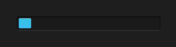
This great tutorial, pure CSS Animated Progress Bar. Someone use Progress Bar for any reasons. In business world Progress Bar is useful, look like 4Shared. Some CSS very helpful here Keyframes animation and animation. This CSS progress bar very easy to customize. You can change the speed, background, or the bar. Codepen help me to build this project. Let's Start
HTML
<div class="progress"><div>
CSS
body {
	  background:#1e1e1e;
  	-webkit-background-size: cover;
	  -moz-background-size: cover;
	  -o-background-size: cover;
	  background-size: cover;
}
.progress {
background-color: #1a1a1a;
	height: 25px;
	padding: 5px;
	width: 350px;
	margin: 50px 0;
	-moz-border-radius: 5px;
	-webkit-border-radius: 5px;
	border-radius: 5px;
	-moz-box-shadow: 0 1px 5px #000 inset, 0 1px 0 #444;
	-webkit-box-shadow: 0 1px 5px #000 inset, 0 1px 0 #444;
	box-shadow: 0 1px 5px #000 inset, 0 1px 0 #444;
  margin-left: 37.5%;
}

.progress div {
  display:block;
background-color: #34c2e3;
	  background-image: -webkit-gradient(linear, left top, left bottom, from(#34c2e3), to(#3cbef2));
	  background-image: -webkit-linear-gradient(top, #34c2e3, #3cbef2);
	  background-image: -moz-linear-gradient(top, #34c2e3, #3cbef2);
	  background-image: -ms-linear-gradient(top, #34c2e3, #3cbef2);
	  background-image: -o-linear-gradient(top, #34c2e3, #3cbef2);
	  background-image: linear-gradient(top, #34c2e3, #3cbef2);
	height: 100%;
  width: 100%;
	-moz-border-radius: 3px;
	-webkit-border-radius: 3px;
	border-radius: 3px;
	-moz-box-shadow: 0 1px 0 rgba(255, 255, 255, .5) inset;
	-webkit-box-shadow: 0 1px 0 rgba(255, 255, 255, .5) inset;
	box-shadow: 0 1px 0 rgba(255, 255, 255, .5) inset;
-webkit-animation:progressbar 15s linear;
-moz-animation:progressbar 15s linear;
-ms-animation:progressbar 15s linear;
-o-animation:progressbar 15s linear;
animation:progressbar 15s linear;

}

@-webkit-keyframes progressbar {
0% {width:0%;background-position:top left;}
100% {width:100%;background-position:bottom right;}
}

@-webkit-keyframes complete {
0% {visibility:hidden;}
1%, 100% {height:1000px;visibility:visible;}
}

@-moz-keyframes progressbar {
0% {width:0%;background-position:top left;}
100% {width:100%;background-position:bottom right;}
}

@-moz-keyframes complete {
0% {visibility:hidden;}
1%, 100% {height:1000px;visibility:visible;}
}

@-ms-keyframes progressbar {
0% {width:0%;background-position:top left;}
100% {width:100%;background-position:bottom right;}
}

@-ms-keyframes complete {
0% {visibility:hidden;}
1%, 100% {height:1000px;visibility:visible;}
}

@-o-keyframes progressbar {
0% {width:0%;background-position:top left;}
100% {width:100%;background-position:bottom right;}
}

@-o-keyframes complete {
0% {visibility:hidden;}
1%, 100% {height:1000px;visibility:visible;}
}


@keyframes progressbar {
0% {width:0%;background-position:top left;}
100% {width:100%;background-position:bottom right;}
}

@keyframes complete {
0% {visibility:hidden;}
1%, 100% {height:1000px;visibility:visible;}
}
We're Done
I hope you like this
David Hosanna Chianardi
14 Years old web designer. He live in Singkawang, Indonesia. In fact, he just can little bit english language. Luckily, Google Translate help him